Linda, a visitor to our booth at the Tamarac Art Festival, asked:
You have a piece titled “Pineland Fog.” Would it look as beautiful in black and white? Or would the sunrise not be appreciated in B & W? Thanks for your insight.
We said
As you put it, we don’t think the sunrise would be fully appreciated in black & white. Although it seems almost like a monochrome already, the sun’s warm glow is very appealing and draws you into the picture (and Bruce doesn’t think the red-yellowish to blue-grayish gradient from bottom to top is that bad either).
But you can check it out yourself.
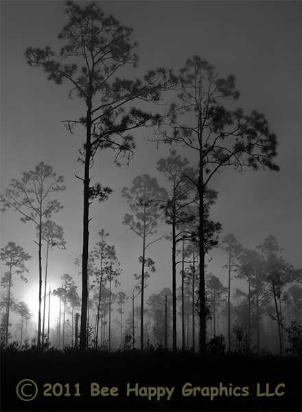
For comparison purposes, the original is at Pineland Fog
We actually think it is very nice in B & W. A metallic paper might go well here. We just like the original better.
But we would really like to hear your opinion.
Leave a Reply