
rev 8/20
Get printable version (.pdf).Color Matching - Part 1
There are times when it might be useful to make the color in one area match the color in another. I learned this trick at a Kelby Training “Photoshop CS3 for Photographers” Seminar in Miami Beach on July 10, 2008, but I have improved it since then. At the seminar, they used their technique to remove a sunburned area on the subject’s skin by using a curves layer to make that area match the nearby non-sunburned area. It might also be useful for matching different areas of sky in a panorama, etc. But the target color doesn’t have to be in the same image, so let your imagination run wild.
As a nature and wildlife photographer, Nancy’s subjects don’t generally get sunburned, and she has no pictures of a beautiful young lady with a sunburn in one of the few places that’s not normally exposed to the sun when wearing her scanty swimsuit. Sorry. Today’s model will be my dad, Joe, in more modest attire (I didn’t bother to tell him, I just stole the picture from his Facebook page. I'm not entirely sure that being compared to a scantily clad model would impress him that much).
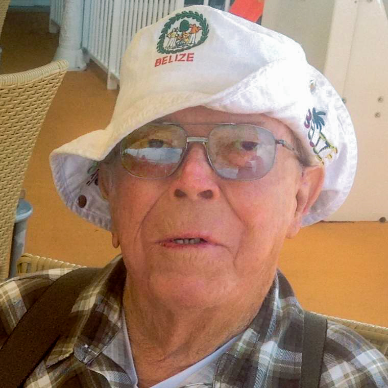
The pretext for this exercise is that we want to make the carpet over his left shoulder (to your right) match the hue of his face, for whatever reason.
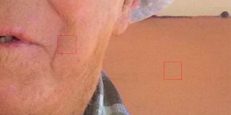
The Procedure
- Select the area to be changed (the carpet) with any of a number of tools (like the Quick Select tool or the Lasso tool). Create a Curve adjustment layer. The selected area will turn into a mask. Although you need a crude mask now so that you can continue to see the target area untouched as you make changes to the area of interest, you may need to adjust the edges of that mask after Step 6.
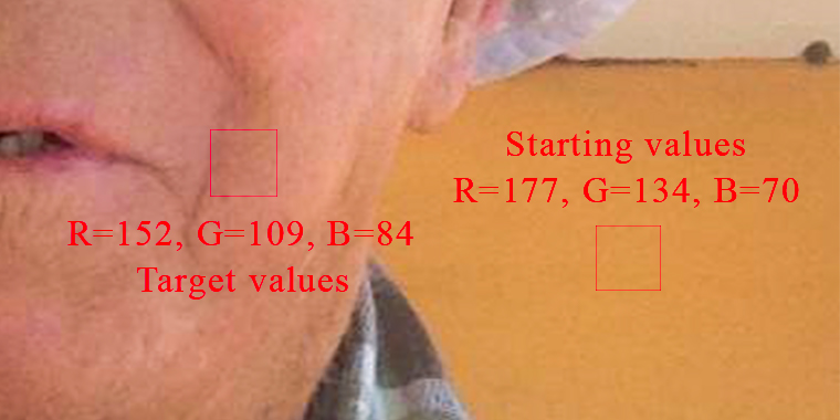
- Using the Eyedropper tool or the Color Sampler tool, find the RGB values for the target color (on dad’s left cheek). You may want to use as large of an eyedropper sample size as will fit in the target area to average out the color variations within that area (In this case I used a 31by 31 sample size, outlined in red). Write down the red (152), green (109), and blue (84) values.
- Do the same for area to be changed. Assuming all pixels in the region have similar hue, you could increase the eyedropper sample size and aim for the lightest spot in the region (In this case I used a 31 by 31 sample, outlined in red). Write down those three numbers (177, 134, and 70).
- Now comes the math (we are working with simple ratios here - multiplication & division - no trigonometry and no calculus). Start with the values for red. Compare the starting (177) and the target (152) numbers. Divide the smaller value by the larger one (152 / 177 = 0.8587...) and then multiply by 255 (0.8587... x 255 ≅ 219). Go to the red histogram of the Curves layer (by using the drop down menu that initially says “RGB” just above the histogram). Click on the little square in the upper right corner of the histogram. If the target number was smaller, either drag that little square down so that the Output (below the histogram) is the number you just calculated or just enter that number in the Output field (the Input should remain 255). If your starting value were smaller, as it is for the blue, drag that little square left until the Input matches your number (and the Output remains 255).
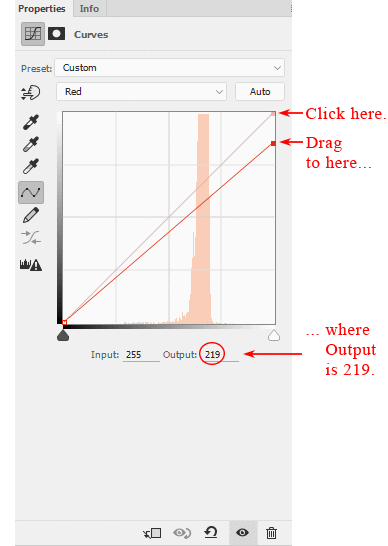
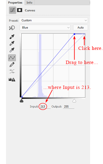
- Repeat Step 4 with both the green and blue histograms. In this example, for the green you drag the upper right corner of the histogram down, since the target was smaller, until the Output is 109 / 134 x 255 ≅ 207. For the blue the starting value was smaller, so you drag that corner to the left until the Input is 70 / 84 x 255 ≅ 213.
- Depending on how well you chose the starting and target points, you may have to adjust the RGB histogram to get the correct intensity. Click in the middle of the histogram box to make a new little adjustment square, and either drag that square up (to make the area lighter) or down (to make in darker) to taste. If you picked good representative samples to begin with, this may not be necessary.
The "After" close-up.
- As I mentioned in Step 1, you may have to adjust the edges of the mask you made earlier. Refining masks is not a trivial matter and I don’t yet consider myself an expert in this area (and I'm reaching the end of my attention span) so the details of this topic will have to wait for another article. (This might be a good workshop or seminar idea for your local camera club). Nonetheless, here are a few ideas to get you started:
- You can use the Brush tool on the mask to change the area covered or to just feather the edge. I generally set the Hardness of the brush to zero and depending on how critical the mask is, I might set the Opacity of the brush as low as 5%. Then after making sure the mask is selected in the Layers panel, I paint (dragging the brush over the image itself) the edge of the starting area with white (to increase the effect) or black (if I went too far). Obviously it takes several passes. If the mask is not that critical or your patience is running thin, increase the Opacity accordingly.
- You can use the Refine Mask window (found under the Select menu or as the Mask Edge button in the refine section of the Masks tab to the Properties window). With it you can feather the edge and increase or decrease the size of the selected area slightly (among other things), which may do the trick but doesn't give you the control of the first option.
What's Next
Recently, I tried using this technique to change the ink color on somebody’s signature while still retaining texture. It didn’t work, even after checking my work twice. The reason soon dawned on me. The explanation and solution are simple. I’ll explain that in Part 2 (see Changing The Color Of A Signature In A Signature File).
You can contact us if you have any questions, or hit the Comment Button below if you have any suggestions for improvement.